Colormaps & images
Displaying a field
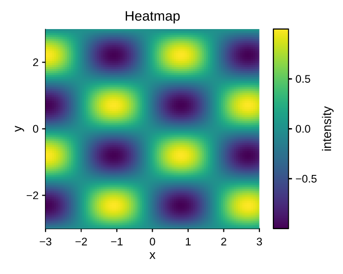
imshow renders a 2D array of numbers as a
colormapped image. data is a sequence of equal-length rows.
"""Image / heatmap with a colorbar."""
import math

import pyplotrs as pp

n = 100
data = [[math.sin(i / 8) * math.cos(j / 10) for j in range(n)] for i in range(n)]
fig, ax = pp.subplots()
m = ax.imshow(data, cmap="viridis", extent=(-3, 3, -3, 3))
fig.colorbar(m, label="intensity")
ax.set(title="Heatmap", xlabel="x", ylabel="y")
fig.save("heatmap.png")
Key options:
| Argument | Meaning |
|---|---|
cmap |
a colormap name or a Colormap (default "viridis") |
vmin, vmax |
data values mapped to the low/high end (default: data min/max) |
norm |
a Normalize (or "log") for a non-linear color scale |
extent |
(x0, x1, y0, y1) data coordinates of the image edges |
origin |
"upper" (row 0 at top, default) or "lower" |
alpha |
mark-level opacity |
Non-finite values (NaN/inf) render as transparent, so masked regions show
the background through.
matshow is imshow with matrix conventions (origin top-left, equal aspect),
and spy marks the nonzero entries of a sparse pattern. For irregular grids
reach for pcolormesh(X, Y, C); for a dense point cloud, hexbin or hist2d.
All of them return the same kind of handle.
Colorbars
The colormapped marks return a handle you pass to
Figure.colorbar; the colorbar is laid out
in a reserved band beside its axes, so it never overlaps the data:
fig.colorbar(m, label="counts",
             orientation="horizontal",   # a band under the plot instead
             shrink=0.8,                 # 80% of the plot extent, centered
             ticks=[0, 50, 100],
             format="{x:.0f}")           # anything pyplotrs.ticker accepts
The tick scale follows the mappable's norm, so a LogNorm image gets
log-spaced colorbar ticks without further arrangement.
Color scales
Pass a Normalize to control how values map onto
the colormap — linear (the default), LogNorm, TwoSlopeNorm for diverging
data about a center, or BoundaryNorm for discrete bands. See
scales & ticks.
Built-in colormaps
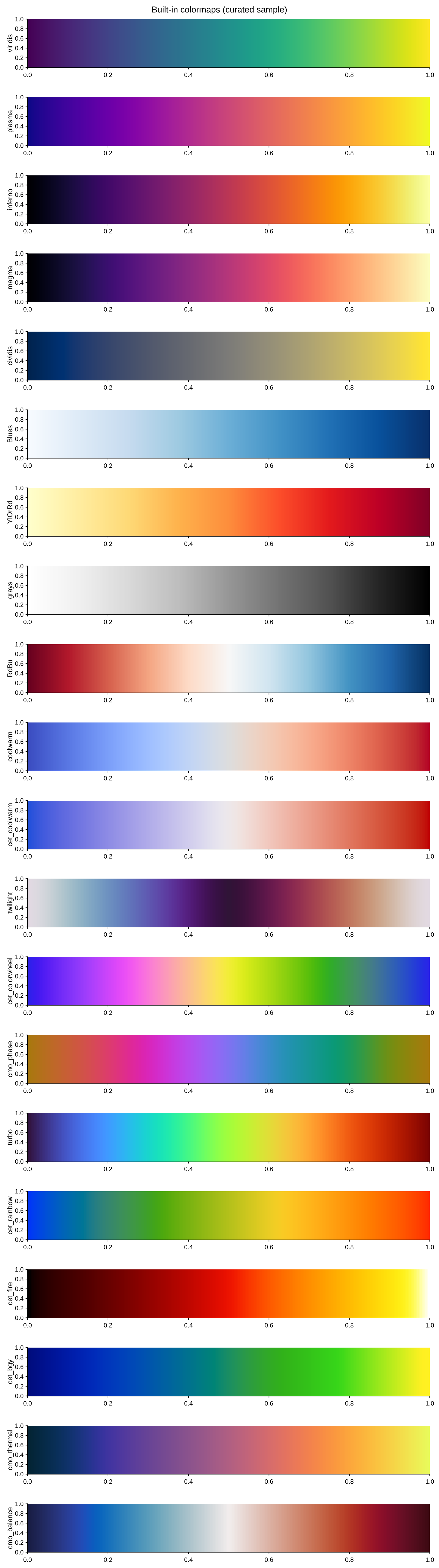
127 continuous colormaps ship as exact 256-entry tables — bit-for-bit faithful to their upstream source, not approximations — curated from three places:
- matplotlib — the perceptually-uniform maps (
viridis,plasma,inferno,magma,cividis), the ColorBrewer-derived sequential/diverging families (Blues,RdBu,Spectral, …), the cyclic maps (twilight,hsv), and the miscellaneous/rainbow family (turbo,cubehelix, …) — upstream names and casing kept exactly. - colorcet — prefixed
cet_(e.g.cet_fire,cet_coolwarm,cet_glasbeyfor large categorical sets — see Palettes). CC-BY 4.0, Peter Kovesi et al. - cmocean — prefixed
cmo_(e.g.cmo_thermal,cmo_balance,cmo_phase), oceanography-oriented maps. MIT, Kristen Thyng et al.
Append _r to any name to reverse it (e.g. "viridis_r").
"""A reference strip across the built-in colormap families (a curated sample
- see ``colormaps.available()`` for the full set of ~125)."""
import pyplotrs as pp

# perceptually uniform, sequential, diverging, cyclic, miscellaneous, then one
# representative pull from each third-party source (colorcet `cet_`, cmocean `cmo_`).
names = [
    "viridis", "plasma", "inferno", "magma", "cividis",
    "Blues", "YlOrRd", "grays",
    "RdBu", "coolwarm", "cet_coolwarm",
    "twilight", "cet_colorwheel", "cmo_phase",
    "turbo", "cet_rainbow",
    "cet_fire", "cet_bgy",
    "cmo_thermal", "cmo_balance",
]
strip = [[j / 255 for j in range(256)] for _ in range(8)]
fig, axs = pp.subplots(len(names), 1, figsize=(560, 100 * len(names)))
for ax, name in zip(axs, names):
    ax.imshow(strip, cmap=name, extent=(0, 1, 0, 1))
    ax.set(ylabel=name)
fig.set(suptitle="Built-in colormaps (curated sample)")
fig.save("colormaps.png")
List them at runtime, optionally filtered to a category ("sequential",
"diverging", "cyclic", "perceptually_uniform", "miscellaneous"):
from pyplotrs import colormaps

colormaps.available()                       # all 127 names
colormaps.available(category="diverging")   # ['BrBG', 'PRGn', ..., 'cmo_balance', ...]
colormaps.get_cmap("cmo_thermal")           # a Colormap object
Picking one
- Sequential data (a quantity with a low and a high end) →
viridisand friends. They are perceptually uniform, so equal steps in the data look like equal steps in the color, and they survive being printed in grayscale. - Diverging data (deviation from a meaningful center) →
RdBu,cmo_balance,Spectral, paired with aTwoSlopeNormso the center sits where it should. - Cyclic data (phase, direction, time of day) →
twilight,cmo_phase. - Categorical data (a handful of distinct groups, not a scale) → not a
colormap at all; see
pyplotrs.palettesbelow.
Avoid rainbow maps (jet, hsv) for quantitative data: they band, invert
perceived ordering, and fail in grayscale. They ship because reproducing an
existing figure sometimes requires them.
Categorical palettes
For a handful of distinct groups, use palettes — short
lists of colors meant to be distinguishable, not ordered:
from pyplotrs import palettes, themes

palettes.available()             # ['Accent', 'Dark2', ..., 'tab20c']
palettes.get("tab10")            # ((31, 119, 180, 255), ...)

mine = themes.default.with_(palette=palettes.get("tab10"))
The set covers matplotlib's tab*, the ColorBrewer qualitative sets, seaborn's
named palettes (sns_*), and colorcet's glasbey family for many-category
data. The theme default is Okabe-Ito, colorblind-safe by construction.
Colorblind-safe is not the same as grayscale-safe, and Okabe-Ito is only the
first. Its C1 (orange) and C2 (sky blue) sit at L* 70.6 and 69.8 — under a
point apart, so a monochrome press cannot tell them from each other however
well they separate in color. Past two series, either pair color with
linestyle so the distinction survives the loss of hue, or switch to
theme="grayscale", which is built to separate on lightness alone.
Custom colormaps
Build a Colormap from a short list of
(position, (r, g, b)) stops:
from pyplotrs.colormaps import Colormap

warm = Colormap("warm", [
    (0.0, (0, 0, 0)),
    (0.5, (200, 60, 0)),
    (1.0, (255, 220, 80)),
])
ax.imshow(data, cmap=warm)
Stops are resampled to 256 entries by interpolating in Oklab by default —
a perceptually uniform color space, so the gradient looks smooth rather than
banding or dipping in perceived brightness the way interpolating raw sRGB
does. Pass space="srgb" for the old naive-lerp behavior, or "lab" /
"linear" for the other supported spaces.
A Colormap is a callable t -> (r, g, b, a) over t in [0, 1], so you can
sample it directly (e.g. to color a series), and warm.reversed() flips it.
An exact 256-entry table can be passed as table= instead of stops=.
Checking a colormap
pyplotrs.color is a small color-science module backed by the
same Rust crate as the tables. It converts between sRGB, linear RGB, XYZ, Lab,
Oklab, Oklch and CAM16-UCS, and scores colormaps:
from pyplotrs import color
from pyplotrs.colormaps import get_cmap

color.cvd_safe_report(get_cmap("viridis"))   # per-CVD-kind distinguishability
color.perceptual_uniformity(warm)            # 0.0 = perfectly even steps; lower is better
color.simulate_cvd((214, 39, 40), "deuteranopia")
color.distance((0, 0, 0), (10, 10, 10))      # perceptual ΔE
Use it to check a hand-built map before committing to it, or to justify a palette choice in a methods section. See the color science API.