Styling & themes
Themes
A Theme bundles every style choice — palette, type
scale, spines, grid, default line weights, legend colors. There is no global
"current theme": you pass a theme to subplots (or Figure) and it flows to
every axes.
Built-in presets (pass the name, or pyplotrs.themes.<name>):
| Preset | For |
|---|---|
default |
The zero-config publication default: Okabe-Ito palette, despined, no grid, compact type sized for a journal column |
grayscale (alias bw) |
default with the color taken out, for a monochrome press |
dark |
default with the ink and the paper swapped: near-black page, off-white type, palette re-aimed at a dark background |
"""Built-in themes: one figure per preset, shown together.

A theme is passed to ``subplots`` and flows to its axes (there is no global
'current theme'). Here we render the same line in each preset.
"""
import math

import pyplotrs as pp

xs = [i * 0.2 for i in range(40)]
ys = [math.sin(x) for x in xs]
for name in ["default", "grayscale", "dark"]:
    fig, ax = pp.subplots(figsize=(300, 200), theme=name)
    ax.line(xs, ys, label="sin")
    ax.line(xs, [y * 0.6 for y in ys], label="0.6·sin", linestyle="dashed")
    ax.set(title=f"theme = {name}", xlabel="t", ylabel="y")
    ax.legend()
    fig.save(f"theme_{name}.png")
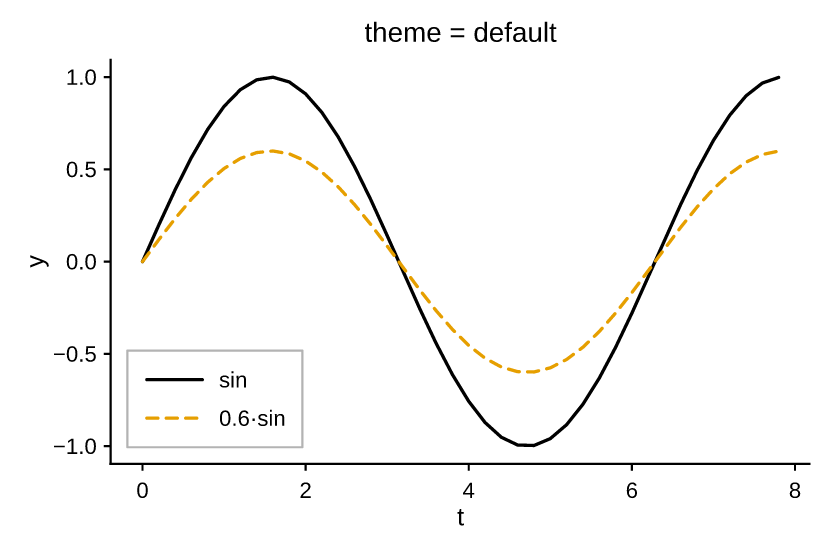
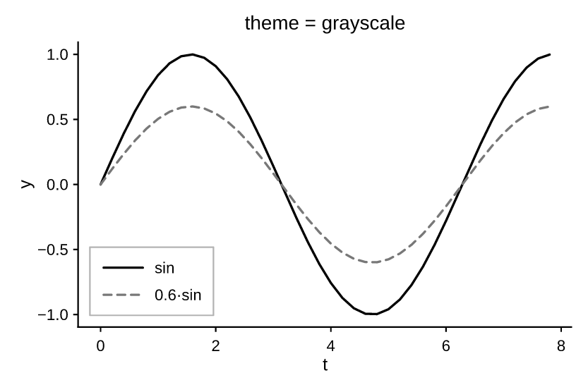

All three share one type scale and one set of rules, so a figure keeps its layout when you switch between them — only the color changes.
The dark theme
dark states a page of its own (figure_facecolor), which no light theme does:
.png already fills its page white, and .pdf/.svg/.html deliberately
paint nothing so a figure drops onto whatever is behind it. White text over
"nothing" is white text on a white page in every viewer that opens it, so the
dark page is painted into every format alike.
Two consequences worth knowing:
transparent=True now means "no page" in every format, not just .png —
which is how you composite a dark figure onto a background of your own.
The palette is Okabe-Ito index for index, so C3 is the same bluish green in
default and in dark and a figure keeps its series colors across the switch.
Only two entries moved. C0 black becomes off-white, since black cannot be
lifted without becoming a different color — which keeps its meaning rather than
breaking it, because C0 stands for "ink, no hue" and not for black in
particular. And Okabe-Ito's blue at C5 reaches just 3.6:1 against the dark
page, so it is lifted in Oklch — hue held, chroma shrunk only as far as the
sRGB gamut demands — to the smallest lightness clearing 4.5:1.
The page is near-black rather than pure black, for the reason every dark UI
theme lands there: #000 under white text glares, and on OLED it blooms around
the type. If you need true black — to sit seamlessly on a black slide, say:
Deriving your own theme
Theme is an immutable dataclass; with_ returns
a copy with changes applied:
import pyplotrs as pp

mine = pp.themes.default.with_(
    grid=True,
    line_width=2.0,
    axes_facecolor=(248, 248, 248, 255),
)
fig, ax = pp.subplots(theme=mine)
Because a theme is a value rather than global config, two figures in the same script — or the same thread pool — can use different ones without interfering.
Every field
| Field | Default | Controls |
|---|---|---|
palette |
Okabe-Ito | The cycling color sequence "C0".."Cn" indexes |
text_color |
black | Titles, labels, tick labels, annotations |
spine_color |
black | Axis lines and tick marks |
spines |
("left", "bottom") |
Which spines (and their ticks) to draw |
spine_width |
0.8 |
Spine stroke width |
spine_join |
"miter" |
How a spine finishes where another abuts it: "miter", "square", "butt" |
tick_label_size |
8.0 |
Type scale, in points |
axis_label_size |
9.0 |
" |
title_size |
10.0 |
" |
suptitle_size |
11.0 |
" |
legend_size |
8.0 |
" |
title_weight |
"normal" |
"normal" or "bold" chrome weight |
suptitle_weight |
"normal" |
" |
axis_label_weight |
"normal" |
" |
line_width |
1.2 |
Default stroke width of a line mark |
grid |
False |
Draw gridlines |
grid_color |
light gray | " |
grid_width |
0.6 |
" |
figure_facecolor |
None |
The page the whole figure sits on (None = paint none) |
axes_facecolor |
None |
Plot-area background fill (None = transparent) |
legend_facecolor |
white | Legend box fill |
legend_edgecolor |
gray | Legend box border |
The type scale is calibrated for a figure printed at journal column width
(~3.3 in), where the page scales it down. Screen-first work usually wants a step
up — default.with_(title_size=14, ...), or simply a larger figsize.
A theme also derives separator_color — the hairline between adjacent filled
shapes such as histogram bins and pie wedges — from axes_facecolor, then from
figure_facecolor, so those seams read as "the background showing through"
whatever the background is.
Colors
Anywhere a color= is accepted you can give:
None— take the next color from the theme palette (auto-cycling);"C0" … "Cn"— an index into this theme's palette (so"C3"follows the active theme, not a fixed global color);- a CSS/matplotlib color name —
"steelblue","red"(case-insensitive); - hex —
"#f80","#ff8800","#ff8800cc"; (r, g, b)or(r, g, b, a)— literal bytes in0–255;- an all-float tuple in
0–1— matplotlib's convention, scaled for you.
ax.line(xs, ys, color="C2")                     # third palette color
ax.line(xs, ys, color=(214, 39, 40))            # literal RGB bytes
ax.scatter(xs, ys, color=(31, 119, 180, 128))   # semi-transparent
The default palette is Okabe-Ito, a colorblind-safe categorical set, in the order Okabe and Ito published it. Two things follow from that order:
C0is black, so a single unstyled line comes out in ink. A lone series has nothing to contrast against, so a hue on it encodes nothing — and black is also the entry that separates best from the other seven, which is why it earns the slot twice over. Ondarkit becomes the page's off-white.C4is yellow, which is only 1.32:1 against a white page. It reads well as a fill but is faint as a 1.2 pt line, so a five-line plot on the stock palette has one weak line. Skip past it with an explicitcolor="C5", or reorder the palette in a derived theme.
Colorblind-safe is not grayscale-safe
Okabe-Ito separates on hue, and its lightnesses are close together:
C1 (orange) and C2 (sky blue) are 0.8 L* apart, below what any
printing system can resolve. Two series are fine — C0 black against
anything is the widest contrast in the set — but a three-line figure sent
to a monochrome press comes out as black plus two identical grays.
Where mono printing is a possibility, either give the series distinct dashes so the distinction does not live in hue alone:
or use the grayscale theme, which is built to separate on lightness.
Swap in any of the built-in palettes:
Fonts
For body text pyplotrs prefers the host's Arial, then Helvetica, before
falling back to the bundled Liberation Sans (Arial-metric-compatible). It is
matplotlib's font.sans-serif behavior, and configurable:
import pyplotrs as pp

pp.set_font_family("Calibri", "Arial")     # try Calibri, then Arial, then fallback
pp.get_font_family()                       # the current preference list
pp.resolved_font_name()                    # what it actually resolves to here
pp.set_font_family()                       # reset to the default
Whichever font is chosen is embedded into every saved figure (PDF/SVG/PNG and the 3D-HTML viewer), so a file saved on one machine looks identical when opened on another — the font choice only affects how that one rendering looks, never its portability. Arial and Helvetica are proprietary and are never bundled; they are only used when already installed on the machine.
Bold and italic
Free text takes weight ("normal"/"bold") and style
("normal"/"italic"), which select a real face of the family rather than
synthetically slanting or smearing the regular one:
ax.text(0.1, 0.9, "emphasis", weight="bold", style="italic")
ax.annotate("callout", (1, 1), xytext=(1.2, 2), weight="bold")
The figure's own chrome is a theme choice, since bold panel titles are a document-wide decision rather than a per-call one:
Each face is embedded as its own subset, so a figure using all four carries four subsetted fonts and every one stays selectable, editable text.
Font matching is approximate: a family with no italic face resolves to its
regular one, so text stays legible but is not slanted.
resolved_font_variants() reports what each
face landed on — two selectors reporting the same name means the host has no
distinct face for one of them:
pp.resolved_font_variants()
# [('body', 'ArialMT'), ('body-bold', 'Arial-BoldMT'),
#  ('body-italic', 'Arial-ItalicMT'), ('body-bolditalic', 'Arial-BoldItalicMT')]
All four Liberation Sans faces are bundled, so emphasis works even on a machine with no fonts installed at all — a slim container, a wheel builder — and a figure looks the same wherever it is generated.
The minus sign
Negative tick labels are signed with U+2212 MINUS SIGN (−2), not the ASCII
hyphen-minus (-2). The two are different characters: the hyphen is a short, low
word-joiner, while the minus is drawn on the math axis at the width of a + and
close to the width of a digit, so a column of tick labels stays aligned. It is
also what $...$ math has always used, so a linear axis and a log axis' $10^{-3}$
read the same.
Turn it off if labels must survive being copied out of a saved SVG or PDF and
parsed back as numbers, or if a font you have set lacks the glyph. The setting
covers labels pyplotrs formats from a number — axis and colorbar ticks, and the
numeric pyplotrs.ticker formatters. Text you write yourself is never
rewritten, so set(xticklabels=[...]), a FuncFormatter, and
DateFormatter("%Y-%m-%d") all keep their hyphens.
Layering
Marks draw in the order you add them, which is usually all the control you need
and is the one thing you can read straight off the code. When something has to
sit above a mark added after it, give it a higher zorder:
ax.line(xs, ys, zorder=2)              # drawn last despite being added first
ax.fill_between(xs, ys, 0, zorder=1)
Ties keep insertion order, so setting zorder on one mark does not reshuffle
the rest. Reference lines (axhline, axvline, spans) and patches always draw
above the data marks.