Plot types
Every 2D mark is a method on Axes. They share a few
conventions:
colormay beNone(cycle the theme palette), a"C0".."Cn"palette index, a CSS name, hex, or an(r, g, b[, a])tuple.label=registers the mark in the legend.alpha=andzorder=work on every mark.- Calls return the axes, so they chain. The
imshowfamily returns a colorbar handle instead.
Lines & points
Line
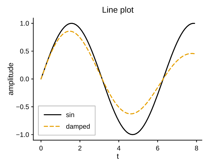
line plots a polyline. linestyle is one of
solid, dashed, dotted, dashdot (or none for markers only); an optional
marker draws a glyph at each vertex.
"""Line plot: multiple series with a legend."""
import math

import pyplotrs as pp

xs = [i * 0.1 for i in range(80)]
fig, ax = pp.subplots()
ax.line(xs, [math.sin(x) for x in xs], label="sin")
ax.line(xs, [math.sin(x) * math.exp(-0.1 * x) for x in xs],
        label="damped", linestyle="dashed")
ax.set(title="Line plot", xlabel="t", ylabel="amplitude")
ax.legend()
fig.save("line.png")
Dense data
line collapses runs of near-collinear vertices in device space by default
(simplify=True) — visually identical output, far smaller and faster vector
files on large data. Pass simplify=False to keep every vertex exactly.
Scatter
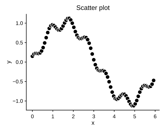
scatter places markers. markersize is the
marker diameter in points — the same unit line(marker=..., markersize=...)
uses, so the same number means the same size everywhere. size is also accepted
and means the area in pt², matching matplotlib's s, so size=36 and
markersize=6 agree. Marker shapes: o s ^ v D (filled) and + x
(stroked).
"""Scatter plot with marker styling."""
import math

import pyplotrs as pp

n = 80
xs = [i / n * 6 for i in range(n)]
ys = [math.sin(x) + 0.15 * math.cos(7 * x) for x in xs]
fig, ax = pp.subplots()
ax.scatter(xs, ys, markersize=6.3, marker="o", color="C0",
           edgecolor=(255, 255, 255, 255), edgewidth=0.8)
ax.set(title="Scatter plot", xlabel="x", ylabel="y")
fig.save("scatter.png")
Pass c= (a per-point array) to color markers by value through cmap/norm;
the call then returns a handle for Figure.colorbar.
Steps & stems
| Method | What it draws |
|---|---|
step(xs, ys, where="pre"/"post"/"mid") |
Step plot |
stairs(values, edges=None, fill=False) |
Step outline over bin edges |
stem(xs, ys, bottom=0) |
Stems from a baseline, topped with markers |
Log-scaled shortcuts
loglog, semilogx and semilogy draw a line and set the corresponding scale
in one call. See scales & ticks.
Bars & categories
bar draws vertical bars;
barh horizontal ones. Bars sit flush on their own
base — the value axis stops there rather than padding past it, whether that base
is the default 0 or a bottom/left you passed — and string positions give a
categorical axis:
"""Vertical bar chart."""
import pyplotrs as pp

x = [0, 1, 2, 3, 4]
heights = [5.1, 7.3, 3.8, 6.4, 4.2]
fig, ax = pp.subplots()
ax.bar(x, heights, width=0.7, color="C3")
ax.set(title="Bar chart", xlabel="category", ylabel="value")
fig.save("bar.png")

width (on bar) and height (on barh) are extents in data units, not
stroke widths. bottom/left offset the baseline, which is how stacked bars
are built.
Related: broken_barh(xranges, yrange) for interval/Gantt bars, and
eventplot(positions) for a raster of event marks.
Distributions
Histogram
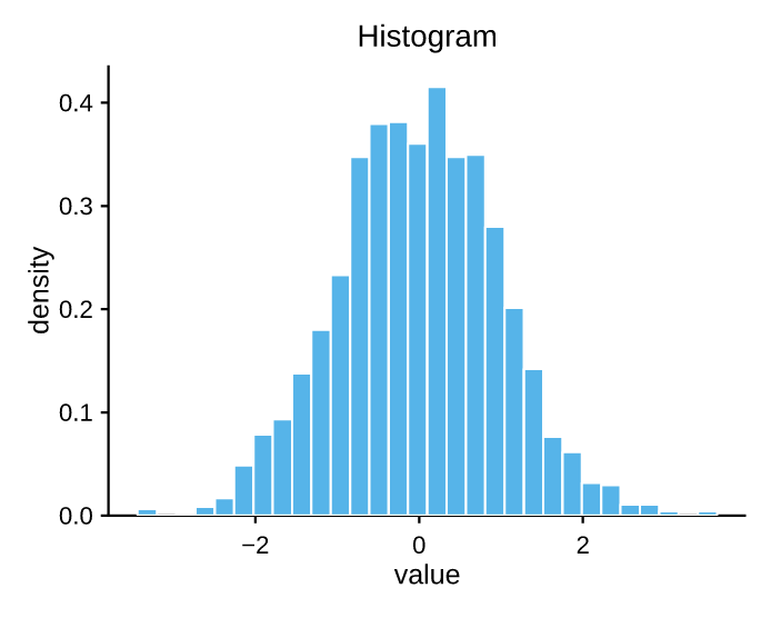
hist bins data into equal-width bins. Use
density=True to normalize to a probability density, and range=(lo, hi) to fix
the binning extent.
"""Histogram of a synthetic distribution."""
import math

import pyplotrs as pp


# Box-Muller normal samples (no numpy dependency).
def normals(n, seed=1):
    s = seed
    out = []
    for _ in range(n):
        s = (1103515245 * s + 12345) & 0x7FFFFFFF
        u1 = (s + 1) / 0x80000000
        s = (1103515245 * s + 12345) & 0x7FFFFFFF
        u2 = (s + 1) / 0x80000000
        out.append(math.sqrt(-2 * math.log(u1)) * math.cos(2 * math.pi * u2))
    return out

fig, ax = pp.subplots()
ax.hist(normals(2000), bins=30, color="C2", density=True)
ax.set(title="Histogram", xlabel="value", ylabel="density")
fig.save("histogram.png")
Box, violin and pie
boxplot draws a box-and-whisker per array
(showfliers=False drops the outlier points);
violinplot draws a mirrored Gaussian-KDE
density — computed in Rust, so no SciPy dependency;
pie draws an auto-normalized pie, turning the frame
off and fixing an equal aspect so the wedges stay circular.
"""Distribution marks: boxplot, violinplot, and a labeled pie."""
import math
import random

import pyplotrs as pp

random.seed(7)
groups = [[random.gauss(mu, sd) for _ in range(200)]
          for mu, sd in [(0.0, 1.0), (1.2, 0.6), (0.4, 1.6)]]
labels = ["control", "drug A", "drug B"]

fig, (ax_box, ax_violin, ax_pie) = pp.subplots(1, 3, figsize=(660, 230))

ax_box.boxplot(groups)
ax_box.set(title="boxplot", ylabel="response", xticks=[1, 2, 3], xticklabels=labels)

ax_violin.violinplot(groups)
ax_violin.set(title="violinplot", xticks=[1, 2, 3], xticklabels=labels)

ax_pie.pie([42, 31, 27], labels=labels)
ax_pie.set(title="pie")

fig.save("statistical.png")
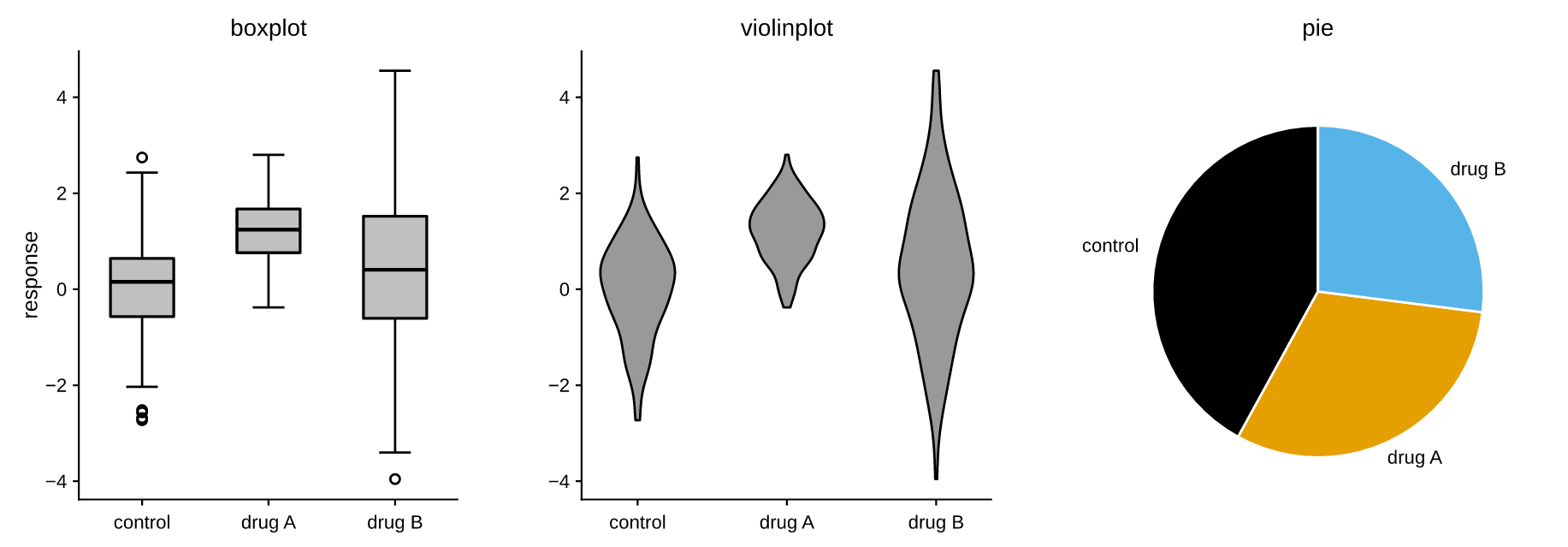
pie is the one mark with no scalar label: its labels are per wedge, so they
come from labels=, which is also what feeds legend(). The pie is fitted in
device space against its measured labels, so a long label shrinks the pie
instead of being clipped.
Uncertainty & bands
Fill between
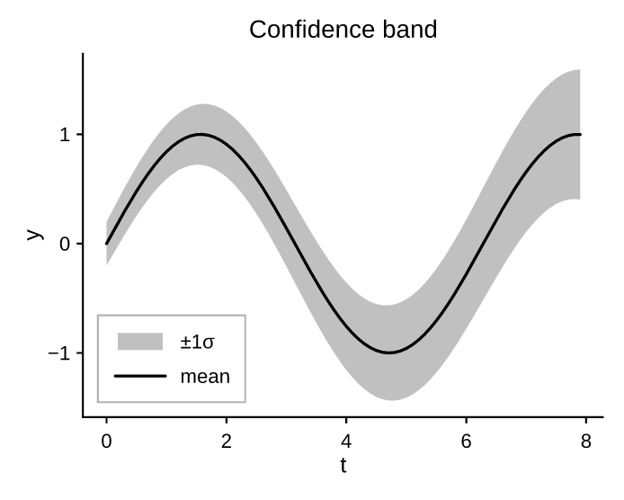
fill_between shades the band between two
curves (or a curve and a constant) — ideal for confidence intervals. alpha
controls transparency, and fill_betweenx is the transpose.
"""Fill between curves: a line with a confidence band."""
import math

import pyplotrs as pp

xs = [i * 0.1 for i in range(80)]
mid = [math.sin(x) for x in xs]
lo = [m - 0.2 - 0.05 * x for m, x in zip(mid, xs)]
hi = [m + 0.2 + 0.05 * x for m, x in zip(mid, xs)]
fig, ax = pp.subplots()
ax.fill_between(xs, lo, hi, color="C0", alpha=0.25, label="±1σ")
ax.line(xs, mid, color="C0", label="mean")
ax.set(title="Confidence band", xlabel="t", ylabel="y")
ax.legend()
fig.save("fill_between.png")
Error bars
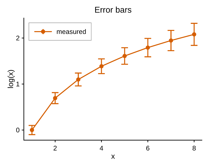
errorbar draws symmetric yerr/xerr bars
with caps, optionally connected by a line and decorated with markers. Pass
linestyle="none" for markers and whiskers only.
"""Error bars with caps."""
import math

import pyplotrs as pp

xs = list(range(1, 9))
ys = [math.log(x) for x in xs]
yerr = [0.08 + 0.02 * x for x in xs]
fig, ax = pp.subplots()
ax.errorbar(xs, ys, yerr=yerr, marker="o", capsize=4, color="C6", label="measured")
ax.set(title="Error bars", xlabel="x", ylabel="log(x)")
ax.legend()
fig.save("errorbar.png")
Stacked areas
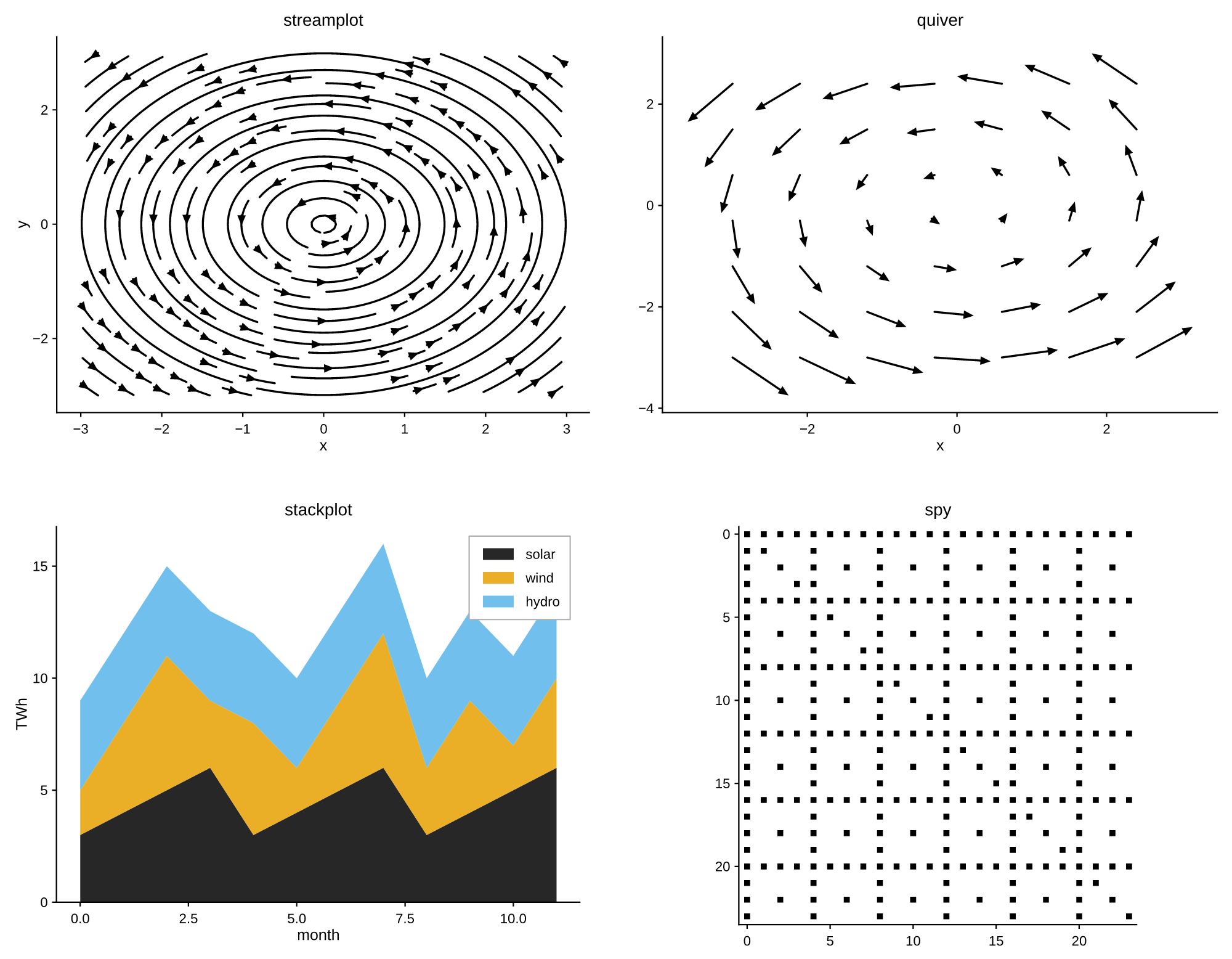
stackplot(x, *ys, labels=[...]) stacks series into filled bands.
Fields, images & contours
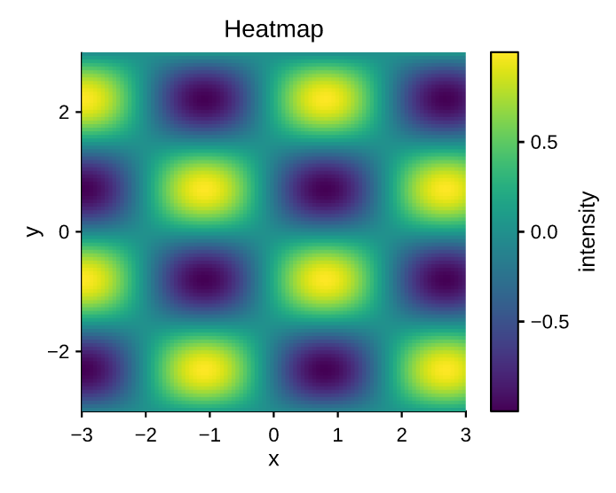
imshow displays a 2D field as a colormapped image
and returns a handle you can pass to
Figure.colorbar. See
colormaps & images for the full story.
"""Image / heatmap with a colorbar."""
import math

import pyplotrs as pp

n = 100
data = [[math.sin(i / 8) * math.cos(j / 10) for j in range(n)] for i in range(n)]
fig, ax = pp.subplots()
m = ax.imshow(data, cmap="viridis", extent=(-3, 3, -3, 3))
fig.colorbar(m, label="intensity")
ax.set(title="Heatmap", xlabel="x", ylabel="y")
fig.save("heatmap.png")
| Method | What it draws |
|---|---|
imshow(data) |
Colormapped image of a 2D array |
matshow(data) |
imshow with matrix conventions (origin top-left, equal aspect) |
spy(data) |
Sparsity pattern: a marker at each nonzero entry |
pcolormesh(C) or pcolormesh(X, Y, C) |
Pseudocolor grid (pcolor is an alias) |
hist2d(xs, ys, bins=...) |
2D histogram as a colormapped image |
hexbin(xs, ys, gridsize=...) |
Hexagonal binning colored by count |
contour(Z) / contourf(Z) |
Contour lines / filled bands |
quiver(x, y, u, v) |
Arrow field |
streamplot(x, y, u, v) |
Streamlines of a vector field, RK4-integrated |
"""Vector-field and matrix plot types: quiver, streamplot, stackplot, spy."""

import pyplotrs as pp

N = 21
xc = [-3 + 6 * j / (N - 1) for j in range(N)]
yc = [-3 + 6 * i / (N - 1) for i in range(N)]
# Solid-body rotation: u = -y, v = x.
U = [[-yc[i] for _ in range(N)] for i in range(N)]
V = [[xc[j] for j in range(N)] for _ in range(N)]

fig, axes = pp.subplots(nrows=2, ncols=2, figsize=(720, 560))
(ax_stream, ax_quiver), (ax_stack, ax_spy) = axes

ax_stream.streamplot(xc, yc, U, V, density=1.1)
ax_stream.set(title="streamplot", xlabel="x", ylabel="y")

step = 3
ax_quiver.quiver(
    [xc[::step] for _ in yc[::step]],
    [[y] * len(xc[::step]) for y in yc[::step]],
    [[-yc[i] for j in range(0, N, step)] for i in range(0, N, step)],
    [[xc[j] for j in range(0, N, step)] for i in range(0, N, step)],
    scale=0.25,
)
ax_quiver.set(title="quiver", xlabel="x")

months = list(range(12))
ax_stack.stackplot(
    months,
    [3 + i % 4 for i in months],
    [2 + (i * 2) % 5 for i in months],
    [4 + (i * 3) % 3 for i in months],
    labels=["solar", "wind", "hydro"],
    alpha=0.85,
)
ax_stack.set(title="stackplot", xlabel="month", ylabel="TWh")
ax_stack.legend()

sparse = [[1 if (i * j) % 4 == 0 or i == j else 0 for j in range(24)] for i in range(24)]
ax_spy.spy(sparse, markersize=3.5)
ax_spy.set(title="spy")

fig.save("fields.png")
The binning, marching-squares and band-fill kernels all run in Rust. hist2d,
hexbin, pcolormesh, contourf and the colormapped scatter all return a
handle for Figure.colorbar.
contour levels are a hint
contour(levels=7) asks for about seven lines and puts them on multiples
of a round step, the way matplotlib does, rather than slicing the data range
into equal parts. contourf fills the bands of that same lattice, so lines
drawn over fills of the same field land on band boundaries — which also
means the outermost bands reach a little past the data, out to the round
numbers.
Guides & shapes
Guides are drawn over the data and mark a threshold rather than plotting one,
but they still have to be visible: a guide contributes the coordinate it
sits at, so axhline(500) over data in 0..1 widens y to include 500 instead
of landing outside the frame. It does not contribute the direction it spans —
that span is an axes fraction, not data — so axhline never touches x.
axline is the exception: it is infinite and has no extent to contribute.
| Method | What it draws |
|---|---|
axhline(y) / axvline(x) |
Reference line across a fraction of the axes |
axhspan(ymin, ymax) / axvspan(xmin, xmax) |
Shaded band, drawn behind the data |
axline(xy1, xy2=/slope=) |
Infinite line, clipped to the plot rect |
hlines(y, xmin, xmax) / vlines(x, ymin, ymax) |
Data-coordinate segments that do autoscale |
hlines vs axhline
hlines takes data coordinates in both directions, so it autoscales in
both. axhline spans a fraction of the axes in x, so only its y moves
the view. Reach for axhline to mark a threshold, hlines to plot data.
Patches are shapes in data space, with facecolor / edgecolor / linewidth /
linestyle / alpha / fill / hatch:
| Method | What it draws |
|---|---|
rectangle(xy, width, height, angle=0) |
Rectangle from its lower-left corner |
circle(xy, radius) |
Circle (an ellipse unless the aspect is equal) |
ellipse(xy, width, height, angle=0) |
Ellipse from its full diameters |
polygon(points) |
Polygon through data-space vertices |
fill(x, y) |
The same, from parallel x/y arrays |
arrow(x, y, dx, dy) |
Arrow from (x, y) to (x + dx, y + dy) |
Layering
Marks draw in the order you add them, which is usually all the control you need
and the one thing you can read straight off the code. When something has to sit
above a mark added after it, give it a higher zorder:
ax.line(xs, ys, zorder=2)              # drawn last despite being added first
ax.fill_between(xs, ys, 0, zorder=1)
Ties keep insertion order, so setting zorder on one mark does not reshuffle
the rest. Guides and patches always draw above the data marks.
Other axes kinds
Axes is the Cartesian 2D vocabulary. Polar and 3D axes
have their own — reach for them with projection="polar" / projection="3d".