Scales & ticks
Everything on this page is an argument to set. There
is no set_xscale/set_xlim/set_xticks family — one method writes an axes,
and the get_* accessors read it back.
"""Axis scales: log, symlog, an automatic date axis, and categories."""
import datetime as dt
import math

import pyplotrs as pp

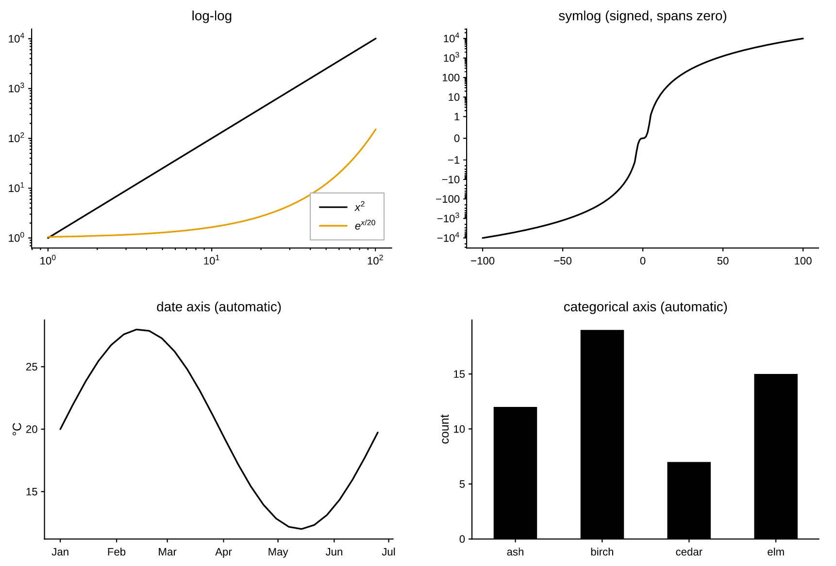
fig, ((ax_log, ax_symlog), (ax_date, ax_cat)) = pp.subplots(2, 2, figsize=(620, 420))

xs = [1 + i * 0.5 for i in range(200)]
ax_log.line(xs, [x ** 2 for x in xs], label="$x^2$")
ax_log.line(xs, [math.exp(x / 20) for x in xs], label="$e^{x/20}$")
ax_log.set(title="log-log", xscale="log", yscale="log")
ax_log.legend(loc="lower right")

ts = [-100 + i for i in range(201)]
ax_symlog.line(ts, [t ** 3 / 100 for t in ts])
ax_symlog.set(title="symlog (signed, spans zero)", yscale="symlog")

# Datetime values switch that axis to a date scale automatically; the
# formatter here just shortens the auto labels from "Jan 2026" to "Jan".
day0 = dt.date(2026, 1, 1)
days = [day0 + dt.timedelta(days=7 * i) for i in range(26)]
ax_date.line(days, [20 + 8 * math.sin(i / 4) for i in range(26)])
ax_date.set(title="date axis (automatic)", ylabel="°C",
            xformatter=pp.ticker.DateFormatter("%b"))

# String coordinates switch that axis to a categorical scale.
ax_cat.bar(["ash", "birch", "cedar", "elm"], [12, 19, 7, 15])
ax_cat.set(title="categorical axis (automatic)", ylabel="count")

fig.save("scales.png")
Axis scales
xscale / yscale take a name or a Scale instance:
| Name | What it does |
|---|---|
"linear" |
The default. |
"log" |
Base-10. Non-positive data becomes a gap, as in matplotlib. Ticks are decades, labeled $10^{k}$ as real math. |
"symlog" |
Linear within ±1, logarithmic beyond — for signed data that crosses zero. |
"logit" |
log10(p / (1 - p)), for probabilities in (0, 1). Gridlines at 0.001 … 0.999. |
"date" |
A time axis over day numbers; usually selected for you (see below). |
loglog, semilogx and semilogy are convenience wrappers that draw a line
and set the scale in one call:
The transform runs per point in Rust, so a nonlinear axis costs no Python per point — the same fast path a linear axis takes.
Scales the data chooses
Two input types select their own scale, so the common cases need no arguments at all:
from datetime import date

ax.line([date(2026, 1, 1), date(2026, 2, 1), date(2026, 3, 1)], [3, 5, 4])
ax.bar(["ash", "birch", "cedar"], [12, 19, 7])
- Datetimes (
datetime,date, or anything datetime-like) switch that axis to aDateScale: values are converted to day numbers viadate2num, and ticks land on calendar boundaries — year, month, day or hour — chosen from the visible span. - Strings switch it to a
CategoricalScale: each distinct label takes an integer position in first-seen order, one tick per category, with the view spanning-0.5 … n-0.5.
Mixing the two on one axis is not meaningful; the last kind of data wins.
Limits, margins and direction
ax.set(xlim=(0, 10), ylim=(-1, 1))   # pin
ax.set(xlim="auto")                  # release a pinned limit back to autoscale
ax.set(margin=0)                     # limits tight to the data
ax.set(ymargin=0.2)                  # 20% padding on y only
ax.set(yinverted=True)               # y descends, and still autoscales
None means "leave alone", so it cannot double as a reset — that is what
"auto" is for. Autoscaling pads the data range by 5% on each side by default;
xmargin/ymargin (or margin for both) replace that fraction, on every scale
— on a log axis the padding is 5% of the decade span, so it looks the same at
both ends. A margin of -0.5 or below is rejected: it would collapse or invert
the axis.
The padding stops where a mark rests on a value rather than merely reaching
it — a stacked area's floor, a bar's base, an image's extent — so those marks sit
flush against the spine instead of floating above it. It is per mark and per
direction, so a line drawn past an image still gets its own margin. A mark that
merely stops somewhere keeps the padding: fill_between(x, y, 0) is padded
below zero, because there 0 is just another curve.
yinverted flips the direction without pinning numbers, which is what you want
for depth profiles or image-like axes that must keep autoscaling. Non-finite
values (NaN/inf) never take part in autoscaling.
aspect="equal" equalizes the data-unit scale on both axes ("auto" releases
it), and axis("off") drops the whole frame — spines, ticks and grid:
Ticks
ax.set(xticks=[0, 1, 2, 3])                      # pin positions
ax.set(xticks=[0, 1, 2], xticklabels=["a", "b", "c"])
ax.set(xticklabels=[])                           # keep ticks, blank the labels
ax.set(yminor=4)                                 # 4 minor intervals per major
ax.set(tick_direction="in", tick_length=4)
Left alone, the locator picks "nice numbers" — multiples of 1, 2 or 5 times a
power of ten — so ticks land on values a reader can do arithmetic with. Pinned
positions that fall outside the view are dropped rather than drawn beyond the
panel. xminor/yminor (or minor) apply to linear axes; log, symlog and logit
axes already subdivide themselves.
Reading back always reports what will actually be drawn:
ax.get_xticks()        # [0.0, 2.0, 4.0, 6.0, 8.0]
ax.get_xticklabels()   # ['0', '2', '4', '6', '8']
ax.get_xscale()        # 'linear'
Formatters
xformatter / yformatter accept a Formatter, a
"{x:.2f}" template string, or any callable — the locator still picks where
the ticks go, the formatter decides how each is written:
from pyplotrs import ticker

ax.set(yformatter="{x:.1f}")
ax.set(yformatter=ticker.PercentFormatter(xmax=1.0))
ax.set(xformatter=ticker.EngFormatter(unit="Hz"))
ax.set(xformatter=ticker.DateFormatter("%b %Y"))
ax.set(yformatter=lambda v, pos: "hi" if v > 0 else "lo")
| Formatter | Writes |
|---|---|
ScalarFormatter |
Plain decimals; scientific=True switches to mantissa/exponent outside a range |
StrMethodFormatter |
fmt.format(x=value, pos=pos), e.g. "{x:.2f}" |
FuncFormatter |
Whatever func(value, pos) returns |
FixedFormatter |
Labels from a fixed list by index — what backs xticklabels= |
PercentFormatter |
value / xmax * 100 plus a symbol |
EngFormatter |
Engineering notation with an SI prefix (k, M, m, µ) |
LogFormatter |
Decades as $10^{k}$ math |
DateFormatter |
strftime patterns over day numbers |
A label may contain $...$ math — LogFormatter relies on it — and it flows
through the same editable-text pipeline as every other label.
The minus sign
Formatters that render a number sign it with U+2212 MINUS SIGN (−2),
not the ASCII hyphen (-2), so a column of negative tick labels stays aligned
and matches what $...$ math has always drawn. Formatters that hand back a
string you supplied — FixedFormatter, FuncFormatter, StrMethodFormatter,
DateFormatter — pass it through untouched, so "%Y-%m-%d" keeps its hyphens.
Turn the substitution off globally with pp.set_unicode_minus(False); see
styling & themes.
Grids
The grid is a theme choice, overridable per axes:
Color scales: norms
The colormap equivalent of a scale is a
Normalize, which maps data values into [0, 1]
for lookup. Pass one to imshow, a colormapped scatter, or the field marks:
from pyplotrs import norms

ax.imshow(data, cmap="magma", norm=norms.LogNorm())
ax.imshow(data, cmap="RdBu", norm=norms.TwoSlopeNorm(vcenter=0.0))
ax.scatter(xs, ys, c=counts, norm="log")
| Norm | For |
|---|---|
Normalize |
Linear between vmin and vmax (the default) |
LogNorm |
Positive data spanning decades |
TwoSlopeNorm |
Diverging data pinned about a center |
BoundaryNorm |
Discrete bands from explicit boundaries |
A colorbar follows its mappable's norm, so a LogNorm image gets log-spaced
colorbar ticks without further arrangement.