Tutorial: a publication figure, step by step
The quickstart showed the shape of the API. This page builds one real figure the whole way: raw measurements in, a two-panel figure with a fit, a confidence band, math labels and a residual strip out — ready to drop into a manuscript.
Every snippet below is a step of the same script. Run them in order in a notebook, or paste the final one into a file.
The data
Plain Python lists. pyplotrs has no NumPy dependency, and nothing here needs one — reaction rate against temperature for two catalysts, with the standard error of each measurement:
import math
import pyplotrs as pp

temp   = [280, 300, 320, 340, 360, 380, 400]
rate_a = [0.112, 0.165, 0.276, 0.402, 0.655, 0.978, 1.551]
rate_b = [0.068, 0.115, 0.174, 0.291, 0.451, 0.741, 1.163]
err_a  = [0.010, 0.014, 0.022, 0.032, 0.052, 0.078, 0.124]
err_b  = [0.008, 0.011, 0.016, 0.026, 0.040, 0.066, 0.105]
Step 1 — look at it
Before styling anything, see the numbers:
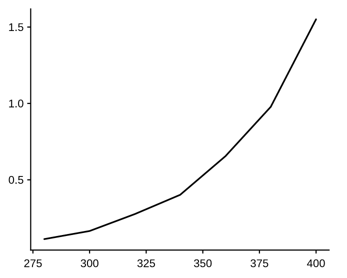
subplots() gave a 250×200 pt canvas — a single journal column — so this is
already at the size it will be printed. In a notebook, the bare fig at the end
of a cell displays it; in a script, call fig.save(...).
Step 2 — the right mark
These are measurements with an uncertainty, so they want
errorbar, not a line. Add the second catalyst,
give both a label, and ask for a legend:
fig, ax = pp.subplots()
ax.errorbar(temp, rate_a, yerr=err_a, marker="o", label="catalyst A")
ax.errorbar(temp, rate_b, yerr=err_b, marker="s", label="catalyst B")
ax.legend()
fig
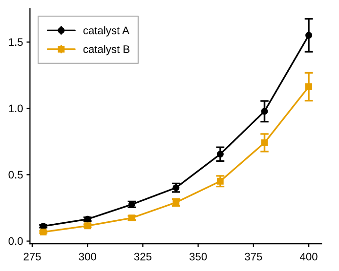
Two things happened without being asked for. The second series took the next
color from the theme palette (Okabe-Ito, colorblind-safe), and legend() drew
keys that mirror the marks — same color, same marker, same line style. A legend
that can disagree with its plot is a legend you have to check; this one is built
from the marks themselves.
Step 3 — a fit, a band, and real labels
Fit the trend, draw it as a line, and shade its confidence band with
fill_between. Marks draw in the order you
add them, so the band goes down first, then the fit, then the points on top:
def fit(ts, ys):
    """Least squares of log y = log A + k·u, with u = (t - 280)/100."""
    us = [(t - 280) / 100.0 for t in ts]
    ls = [math.log(y) for y in ys]
    ubar, lbar = sum(us) / len(us), sum(ls) / len(ls)
    k = (sum((u - ubar) * (l - lbar) for u, l in zip(us, ls))
         / sum((u - ubar) ** 2 for u in us))
    return math.exp(lbar - k * ubar), k

A, K = fit(temp, rate_a)
model = lambda t: A * math.exp(K * (t - 280) / 100.0)

fine = [280 + i for i in range(121)]
curve = [model(t) for t in fine]
band = [0.08 * y for y in curve]

fig, ax = pp.subplots()
ax.fill_between(fine, [y - e for y, e in zip(curve, band)],
                [y + e for y, e in zip(curve, band)],
                color="C0", alpha=0.2, label="95% CI")
ax.line(fine, curve, color="C0", label="fit")
ax.errorbar(temp, rate_a, yerr=err_a, marker="o", linestyle="none",
            color="C0", label="catalyst A")
ax.errorbar(temp, rate_b, yerr=err_b, marker="s", linestyle="none",
            color="C1", label="catalyst B")
ax.set(title="Catalyst activity",
       xlabel=r"temperature $T$ (K)",
       ylabel=r"rate $k$ (s$^{-1}$)")
ax.legend(loc="upper left")
fig
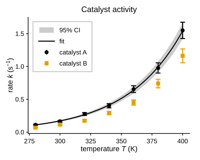
Three things worth naming:
color="C0"is this theme's first palette color, not a fixed color. Indefaultthat is ink, because Okabe-Ito leads with black; indarkthe sameC0is off-white. The band, the fit and the points share it because they are one story, so switching the theme moves all three together.linestyle="none"on the error bars leaves the markers and whiskers but drops the connecting line — the fit is the line now.$...$in the labels is real LaTeX math, typeset by pyplotrs' own engine. Write those strings raw (r"...") so Python leaves the backslashes alone. In the saved PDF thes⁻¹stays selectable text, not a picture of text.
Step 4 — a second panel
A residual strip under the main panel is the standard way to show how well the fit does. Two rows, sharing x, with the top panel three times as tall:
fig, (top, bottom) = pp.subplots(2, 1, figsize=(250, 260), sharex=True,
                                  height_ratios=[3, 1])

# ... the same four marks as before, on `top` ...
top.set(ylabel=r"rate $k$ (s$^{-1}$)", xticklabels=[])
top.legend(loc="upper left")

resid = [r - model(t) for t, r in zip(temp, rate_a)]
bottom.axhline(0.0, linestyle="dashed")
bottom.scatter(temp, resid, color="C0")
bottom.set(xlabel=r"temperature $T$ (K)", ylabel="resid.",
           yticks=[-0.01, 0.0, 0.01])

fig.set(suptitle="Catalyst activity")
fig
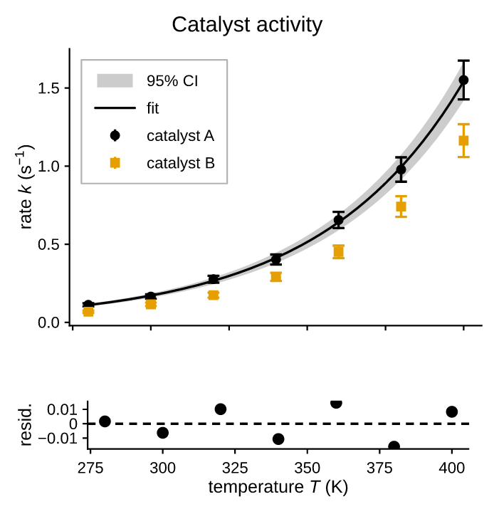
height_ratios=[3, 1]weights the rows. Only the proportions matter, and the gutter between panels keeps its size, so the weighting moves the panels rather than the space between them.sharex=Trueunifies the x range across both panels so they line up. Each panel still draws its own tick labels, which is duplication here — so the top panel blanks its own withxticklabels=[].axhlineis a guide: it spans the panel and never affects autoscaling. Its data-coordinate sibling ishlines.yticks=[...]pins the residual ticks to round numbers instead of the five the locator would fit into a short panel. Pinned positions outside the view are dropped, so this is safe even if the residuals shrink.fig.set(suptitle=...)is figure-level chrome; the per-panel title moved out of the axes since it now describes both.
Step 5 — call out what matters
annotate points text at a data coordinate:
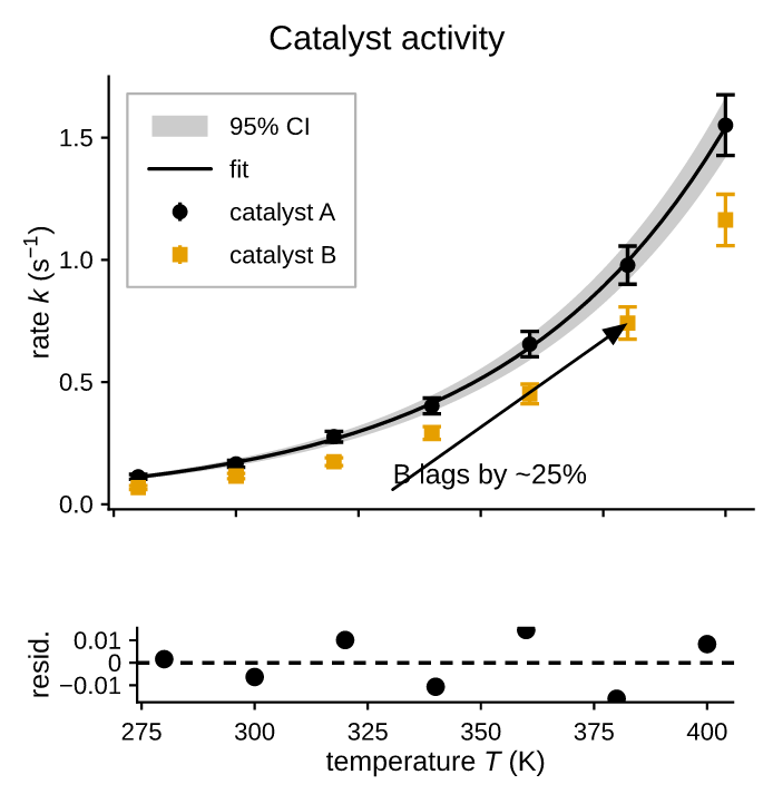
xy is the point being described, xytext where the label sits — both in data
space. Pass arrow=False for a floating label with no leader.
Step 6 — save it
fig.save("catalyst.pdf")                 # for the manuscript
fig.save("catalyst.png", dpi=600)        # for the slide deck
fig.save("catalyst.html")                # for the lab notebook / web
The PDF is the point of the exercise: its text is genuine embedded, subsetted font data, so a co-author can open it in Illustrator and re-type a label without the figure being regenerated. Check it yourself:
pdftotext catalyst.pdf - | head    # the labels come out as text
pdffonts catalyst.pdf              # the embedded subsets
If the figure is going somewhere that has to be accessible, add a tagged structure and alt text:
fig.save("catalyst.pdf", tagged=True, title="Figure 2",
         alt="Reaction rate against temperature for two catalysts, "
             "with an exponential fit and residuals.")
Step 7 — retarget it
Nothing above is tied to one output style. The same figure code takes a
theme, so the manuscript version and the dark-slide version differ by one
word:
fig, (top, bottom) = pp.subplots(2, 1, figsize=(250, 260), sharex=True,
                                  height_ratios=[3, 1], theme="dark")
And a journal with a hard column width takes its units directly:
Because a theme is an argument rather than global state, two figures with different themes can be built in the same script — or the same thread — without either one leaking into the other.
Where to go next
- The notebooks — the same material to run rather than read, including this figure built up in layout and composition
- Plot types — the full mark vocabulary
- Layout — mosaics, spanning panels, insets, twin axes
- Scales & ticks — log axes, dates, categories, formatters
- Styling & themes — deriving your own theme
- Saving figures — what each format guarantees